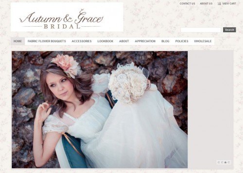
Every month we put out the call for our shop critique, the shops submitted keep getting better and better! For May we picked Autumn of Autumn & Grace Bridal because she’s just made the move from Etsy to her own site. Yay! Double yay is that she’s priced herself out of Etsy with her absolutely stunning bouquets. So pull out your notepads and see how we’re going to help Autumn make her new shop a money-maker. You can follow along at Autumn & Grace Bridal.
Things We Loved:
- We swooned when we saw the beautiful branding on the site. A lot of time obviously went into the planning because the font and color choices match the bouquets and the feel of the photographs so well!
- Policies page! This is something custom makers absolutely need. One thing to consider would be to rename it FAQ so that it’s a bit less intimidating.
- Great incentive for your mailing list! However, to up your conversion rate, you’ll want to move it up higher since you really have to scroll to find it. Perhaps a Hello bar?
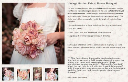
- More swoon-worthy photographs on your sales pages and lookbook! Truly, truly gorgeous.
- Beautifully written content. You really did your research!
Things We Would Tweak:
- Move the About page to the second tab on the navigation bar as for most websites it is the second most visited page after the home page.
- We would change the font on the About page to match the font on the sales pages and policies pages (although the spacing on the policies page is tighter than on other pages and makes it a bit hard to read). The bold is a bit intimidating compared to the softness of the font in the header.
- Move your schedule information up on your About page if it’s something that you really want your customers to know about or if you’re always having to race against the clock to get orders out.
- If most people send you vintage material, I would make a bigger part of your first paragraph on your about page because it’s something that defines your customers. The more you can whittle down your ideal customer and prove that you know and understand them, the easier it is to connect and win over your visitors.
- It’s so important to have an appreciations page on your site but we would narrow down your testimonials. Having to scroll so far makes it a bit daunting. Plus, having people send in photos from their wedding would really make this more personal and increase your customer’s trust! I would put the press mentions under the testimonials actually since it looks odd to just have one magazine cover photo.
- You knew we were going to tell you this but: nix the blog. You haven’t updated in over 9 months so there’s not much point directing people there. It would be better to spend your time marketing your site to magazines and wedding blogs than keeping the blog going.
- Undo the bold words in your descriptions. It makes you appear SEO-desperate and Google will find those words bold or not. Plus, the bolded words don’t really help your customers decide on a bouquet as they’re a bit vague.
We hope this critique helps not only Autumn but you as well. There’s never an end to the tiny tweaks you can make to your site to increase sales and make your customers happy. Please let us know below if this critique helped you with your site!
Thank you so much for your insightful critique of my shop! I’m absolutely thrilled and encouraged by your feedback, and I’ll be making changes as per your wonderful suggestions. Thank you, again, for your time and help!!!
You are so welcome! I meant to email you to let you go but obviously I forgot. I’m so happy you found it helpful! Your site truly is gorgeous. 🙂