It’s finally here! We’re thrilled to congratulate Laura of Mina + Oli for winning our free shop critique for September. This time instead of going page by page (since Laura has so many), we’re going to do the site overall and insert in screenshots to make things easier. You can also follow along on Laura’s site: Mina + Oli. So let’s jump right in and look at this gorgeous shop.
Things we loved about the site:
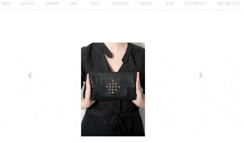
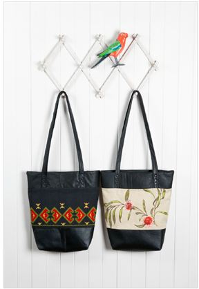
- First off, we can’t say enough about Laura’s gorgeous photographs, especially those in her gallery in Lookbook. She really read her camera manual and captured the beauty of her purses. It’s great eye candy for any customer.
- We were thrilled to see a press page. This is the page to put all of your social proof and show your customers just how much other people are gushing about you. This is also the place to put your press kit for publicists and editors.
- Laura’s about page was short and concise but it really expressed her passion and the why behind her business. The photographs of her grandmother were a nice touch as well. You really feel like you know her.
- Triple bonus points for a favicon!! That’s the little personalized tab image for all of you who are wondering. Laura personalized hers with the pink box and her shop name so that even if you’re in another tab, you see her branding right away.
Things we would tweak:
- Her landing page includes two ‘Polaroid’ photos but no clear call to action. We weren’t sure where to go first. Laura needs to decide what’s the #1 thing she wants people to do and direct them there with her landing page.
- Laura has a gallery, a Lookbook, AND a shop. That means people have to click A LOT before they actually get to the shop and the more they window shop, the less likely they are to buy. We would either get rid of the gallery (and use those gorgeous photos in the shop) OR edit the gallery to include links to the item in the shop. That way if people like what they see in the gallery, they can click the link and go right to the shop to buy it. If you use NextGen Gallery in WordPress, this is a simple task of adding in the html code in the description box.
- Once we were in the shop, we were a little disappointed to see that the shop photos didn’t always include an in-use photo. Showing your work in someone’s hands really helps them visualize it in theirs. Yes, Laura has those amazing photos in her Lookbook but not everyone is going to go through their first. Make sure you put your best pictures everywhere!
- Mina + Oli sports bright pink on the loading pages but there’s no banner or header or even any pink on the main navigation bar. We had a hard time remembering what site we were on since it didn’t say Mina + Oli anywhere. Let’s see more pink, Laura! Hehe.
- It’s a really good idea to have EVERY page on your site branded the same. Laura’s blog and shop are on different platforms, which means you can tell you’re going to a different site. It also makes it harder to go back to the main site. It just takes a little bit of coding to make the big cartel shop match your main site. We would also suggest moving her blog over to WordPress and get off blogspot all together. This will help with page ranking but also it just takes a simple plugin to make the transfer.
We hope this critique helps not only Laura but you get excited about cleaning up your site and ramping up your sales. Please let us know below if this critique helped you with your site!
Want more? Check out our e-course Convert Your Creativity to learn how to increase your sales conversions and build a show that brings in the money you want.


Great critique! There were plenty of things here that could help me and anyone with their shop. It’s amazing how the little details can effect the overall impact of your visitor’s experience.
One comment regarding the layout of the shop – I have a 19″ monitor, and at 1600 x 1024, half the horizontal space is blank, with only 3 items showing per line.
Sometimes it’s hard to get into the code to change this, but I find it’s more aesthetically pleasing to have more of the horizontal space used rather than have things forced down, and down, and down the page…
Oh that’s a really good point! I was looking at it on my laptop (not my bigger screen) and I didn’t even think of that. Good idea, Karen! I think there is a plugin that reconfigures your page to fit the person’s specs (even as they re-size their windows).
Thank you so much for the extremely useful information. It will all go to good use!
Love the post. So, what is page ranking and should everyone move to WordPress? I’m on Blog.com. How can I know whether it is better to move to WP?
I don’t know about all shopping cart/shop software packages, but I built a site using Zen Cart and there’s an available WordPress plugin, so I’m assuming it’s because of the vast amount of configurable options and interconnectivity/interoperability between the two.
WordPress is open source, which means it’s very configurable as people are always adding bells and whistles and templates and color schemes. I read somewhere that you should try out the different blog sites and see which one you like; each one has its advantages.
Do you own your own .com? WordPress is 2 different things: one is a blog and one is a website-building platform. The blog (wordpress.com) is free and your site will have a URL like this: http://www.studiomme.wordpress.com. However, if I build a site with wordpress.org and set up a page that IS a blog, the URL will be like this: http://www.studiomme.com/blog. This means that I control how people get to the site and it’s much easier for people to search for me because ALL of my stuff is on one site. Thus the google search does not bring up two sites: my site AND my blog. That just makes people wonder which one to click on.
Hey there, thanks do much for the shop critique.
So much great advice on what to tweak!
My partner (the computer genius) who designs my site for me read the post and said
“she’s right, lets make some changes”.
Battle half won, no arm twisting needed!
Thanks again,
Laura
Thank you so much for sharing that with me, Laura! I’m so happy it helped. Really they’re just small tweaks and I hope it didn’t make you mad at all. I love your use of hot pink and I think you customers will too. Plus, you have the hardest part already done: the photographs!
This was a great critique! Thank you Megan & Laura for publicly sharing the critique. On the subject of gallery/lookbook/shop I would suggest in the meantime of condensing those to rearrange the tabs in the order of what’s most important. For example if the priority is sales, then the first tab on the left should be SHOP, then go left to right in order of priority. I love how fresh and clean the site is.
I couldn’t agree more, Renee. A great way to show people what’s important and where to go is the order of your tabs. So glad you liked the critique!
HI
It was a good critique Megan. I just wanted to share a link that allows you to check out your site to see how its looks on different size screens. http://www.viewlike.us/
What i would say is don’t get overwhelmed with how your site looks in all of them because you will not be able to please all unless you has a responsive or mobile theme. However if you look at your analytics software you can see which size screen is more popular when viewing your site, then you can tweak accordingly.
Blessings Janet
While I have neither a blog nor a website – yet – this is valuable information to review once I decided to make the leap. Thank you Megan and Laura!